Themes and Appearance
This guide provides a step-by-step walkthrough on how to navigate to the Themes & Appearance section from your survey interface. This section allows you to customize the look and feel of your survey, including layout, colors, and branding.
Prerequisites
Ensure the following before proceeding:
- You are logged into your account on the platform.
- You have access to the Survey Design interface.
- Your survey is at least in the Prelaunched state.
1. Go to the Settings Menu
- At the top of the screen, locate and click on the Settings tab found in the navigation bar next to “Manage Collected Data”.
2. Open the Dropdown Menu
- Click Settings to reveal a dropdown menu.
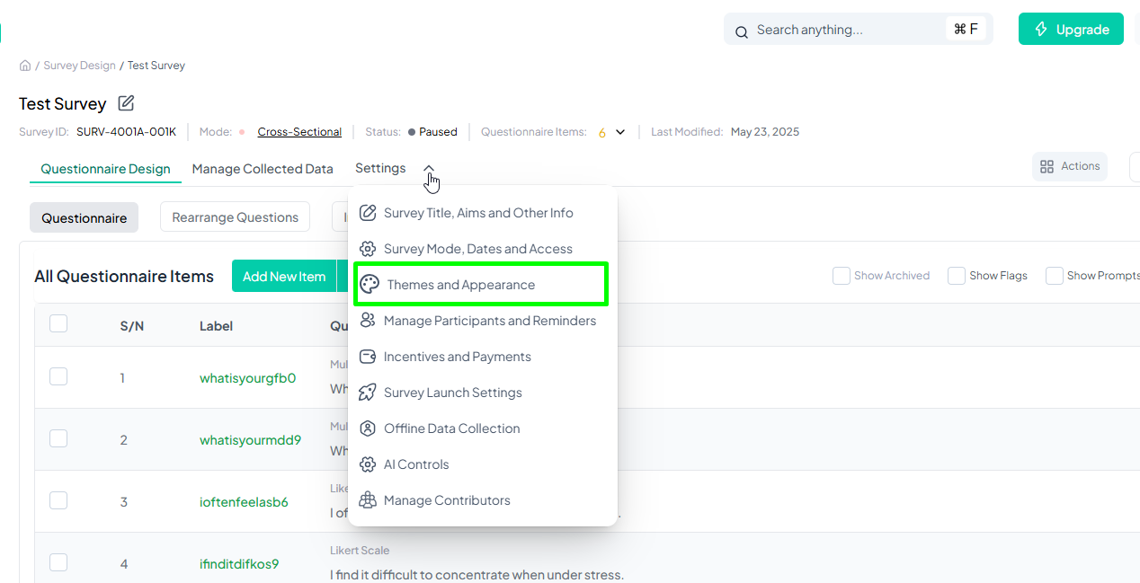
3. Select "Themes & Appearance"
- In the dropdown menu, locate and click on: Themes & Appearance
- This will direct you to the customization interface.
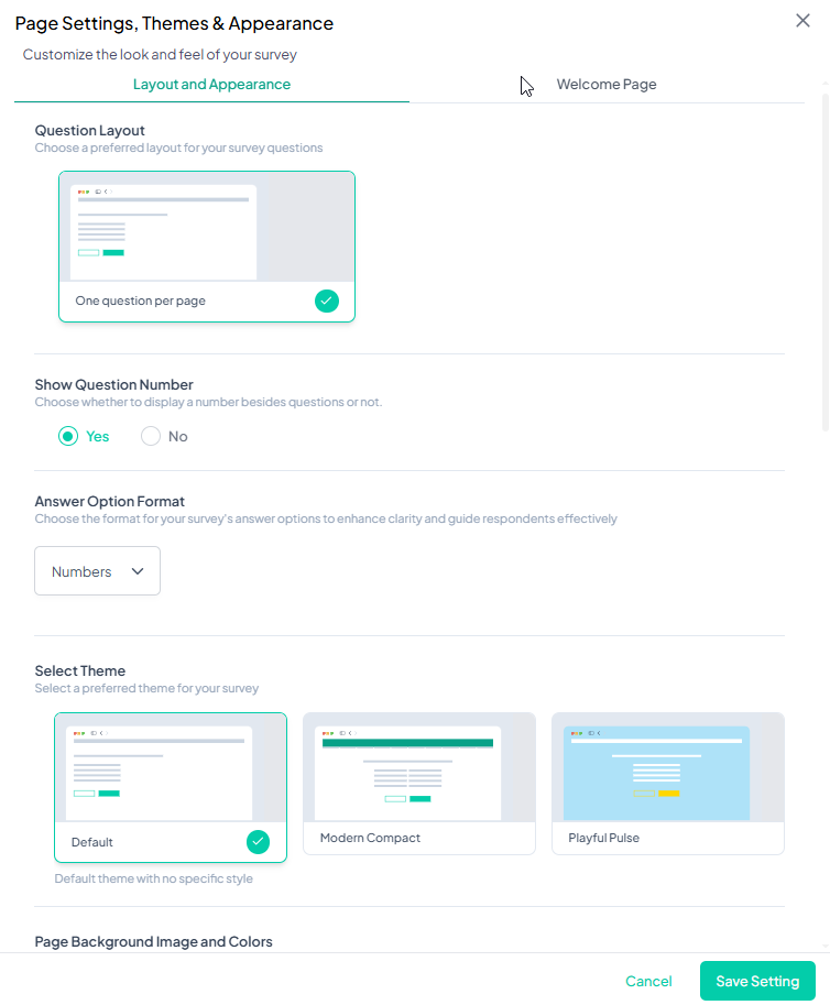
1. Layout and Appearance
This section helps users define how survey questions appear and how the survey page is designed.
1.1 Question Layout
Users can choose how questions are displayed to participants:
- One question per page: Displays each question on a separate page.
- All questions at once: Displays all questions on a single page.
1.2 Show Question Number
Enables or disables question numbering:
- Yes: Displays a number beside each question.
- No: Hides question numbers.
1.3 Select Theme
Users can select from pre-designed themes to apply a consistent look to the survey. The default theme is selected by default.
1.4 Page Background Image and Colors
Users can modify the background appearance by:
- Setting a background color (default: #FFFFFF)
- Uploading a background image to customize the survey interface.
1.5 Page Fonts
Users can customize text appearance by selecting:
- Font family: Choose from available fonts (e.g., Roboto).
- Font color: Adjust text color.
- Font size: Modify the text size (default: 14px).
1.6 Page Button Display
Users can modify button styles and colors:
- Button Style: Choose between a filled or border stroke button design.
- Primary and Secondary Button Colors: Set custom colors for survey buttons (default: #03CDAA).
2. Welcome Page
This section allows users to create a professional introduction for their surveys.
2.1 Survey Page Header
Users can customize the survey title and branding:
- Survey Display Title: Enter a title that participants will see.
- Brand/Company Name: Optional field to display the organization’s name.
- Brand/Company Logo: Upload and position a logo (Left or Right).
2.2 Welcome Page Settings
- Enable or disable the welcome page to display an introduction before the survey begins.
- Survey Welcome Prompt: Customize the message displayed to participants when they first access the survey.
2.3 Survey Tagline
Users can add a tagline above the title for additional context.
2.4 Collection Start and End Date
Users can enable or disable displaying survey start and end dates.
2.5 Welcome Page Illustration
Users can select an illustration or upload a custom image for the welcome page.
2.6 Start Button Label
Users can modify the label text for the button that initiates the survey (default: "Start Survey").
Saving Changes
After customizing the survey appearance, users must click Save Settings to apply their changes.


